PRODUCT DESIGN
COMPANY
Above Sports
ROLE
Product Designer
Scope
4 months
YEAR
2024
Tracking logos on jersey and pitch
Above Sports is a Copenhagen-based sports tech company providing a comprehensive sponsorship management platform that connects football and handball organizations with their corporate partners. The platform enables automated video analysis by detecting and tracking sponsor logos during matches.

Based on user research and client requirements we identified the need for a Logo Search page, a dedicated feature allowing clubs and sponsors to analyze logo appearances within match footage. The platform lacked a video based feature, limiting stakeholders’ ability to measure sponsorship exposure effectively.
The objective was to design a user-centered interface that gives teams and sponsors full control over their video content analysis while ensuring data is easy to interpret and act upon.
Team and my role
This was a cross-functional initiative with a dynamic team setup that evolved throughout the project lifecycle. The core team included a product manager, 2 product designers, 3 developers, and 2 data analysts.
As one of the product designers, I was responsible for the end-to-end design process, including:
Participating in user research and ideation workshops to identify requirements and pain points.
Developing low-fidelity wireframes to frame key user flows and validate structure early.
Translating concepts into high-fidelity prototypes and maintaining consistency within the platform’s design system.
Driving iterative usability testing to validate interaction patterns, optimize workflows, and improve overall product usability.
My role emphasized ensuring the Logo Search page provided an intuitive, insight-driven, and scalable user experience that empowered users to extract actionable sponsorship data from match footage.
Football and Handball match analysis
User journey mapping and stakeholder interviews uncovered key pain points in sponsorship data visualization, guiding the page’s functional priorities. Rapid prototyping and frequent iteration cycles enabled the team to validate concepts quickly, leveraging real user feedback to optimize interface clarity and navigational logic. Cross-disciplinary collaboration, including design feedback sessions and usability testing, ensured each touchpoint aligned with both user needs and technical feasibility.

Miro board with ideas
Research & Analysis
Feedback was gathered from sponsorship managers and marketers who manage partnerships and report outcomes to sponsors. Their biggest challenge was the lack of clear, real-time evidence showing how much visibility a sponsor’s logo receives during a match. Traditional post-game reports and estimates left room for doubt and made it difficult to justify increased contract value or adjustments for future deals.
This page was dedicated for football and handball clubs, since they had the rights to hold the match videos.

Information Architecture
All match videos are stored in a single, organized library within the platform, functioning as a dedicated digital asset management system for clubs.
Users can easily browse, search, and filter by season, opponent, date, or competition, using faceted navigation so they quickly locate specific matches without friction. Each match has a dedicated page presenting relevant video footage, interactive timeline controls (for jumping to key events), and a dashboard of related statistics and analytics.
All matches in one platform
This page serves as the Logo Search results dashboard for Above Sports, designed to help users efficiently locate and analyze football match footage.
Matches are displayed in a card-based grid with thumbnail images, club names, date, and timestamp overlays. This visual hierarchy delivers instant at-a-glance recognition and scanning, key for media-rich platforms.
Each match thumbnail acts as an entry point to deeper analysis, fostering a clear information scent and supporting progressive disclosure of match data and statistics.

Logo search thumbnails
Video Player & Controls
The main area shows the match footage with clear playback controls underneath, including rewind (5s, 15s, 1m), play/pause, and volume adjustments, supporting precise navigation through the video timeline.
Below the video progress bar is a detailed, zoomed timeline featuring color-coded logo visibility intervals for different sponsors, allowing users to quickly identify when and for how long each sponsor’s logo appeared on screen.

Example of a match analysis
Each sponsor (Adidas, Carlsberg, Nike, Spar Nord, Arbejdernes Landsbank) has its own row showing distinct colored blocks representing the times their logos were detected on screen. The length and position of these blocks correspond to the duration and timing of logo visibility.
Next to each sponsor’s name are summary stats such as the number of times recognized and the Total Time Exposure (TTE), quantifying visibility to support sponsorship ROI analyses.
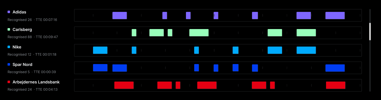
Timeline with details
On the right, a scrollable list shows short video clips or logo appearances with timestamps, enabling users to jump directly to key moments or create a customized viewing playlist.

Playlist with details
Customers gain clear and actionable insights from the data
This interface provides sponsors and analysts with an intuitive yet powerful tool for visualizing, quantifying, and exploring sponsorship logo exposure during a match, combining rich media playback with actionable data insights for strategic decision-making.
User engagement
Increased session duration by 25% due to improved navigation and playlist management features
Conversion rates
Blues saw a 15% increase in premium subscriptions following the redesign, thanks to a clearer call to action and streamlined onboarding process.
Growing User Base
The app quickly gained traction among individuals and businesses worldwide, with a steady increase in user adoption and engagement.


