Mobile design
COMPANY
Aalborg University
ROLE
Researcher & UX/UI Designer
Scope
6 months
YEAR
2022
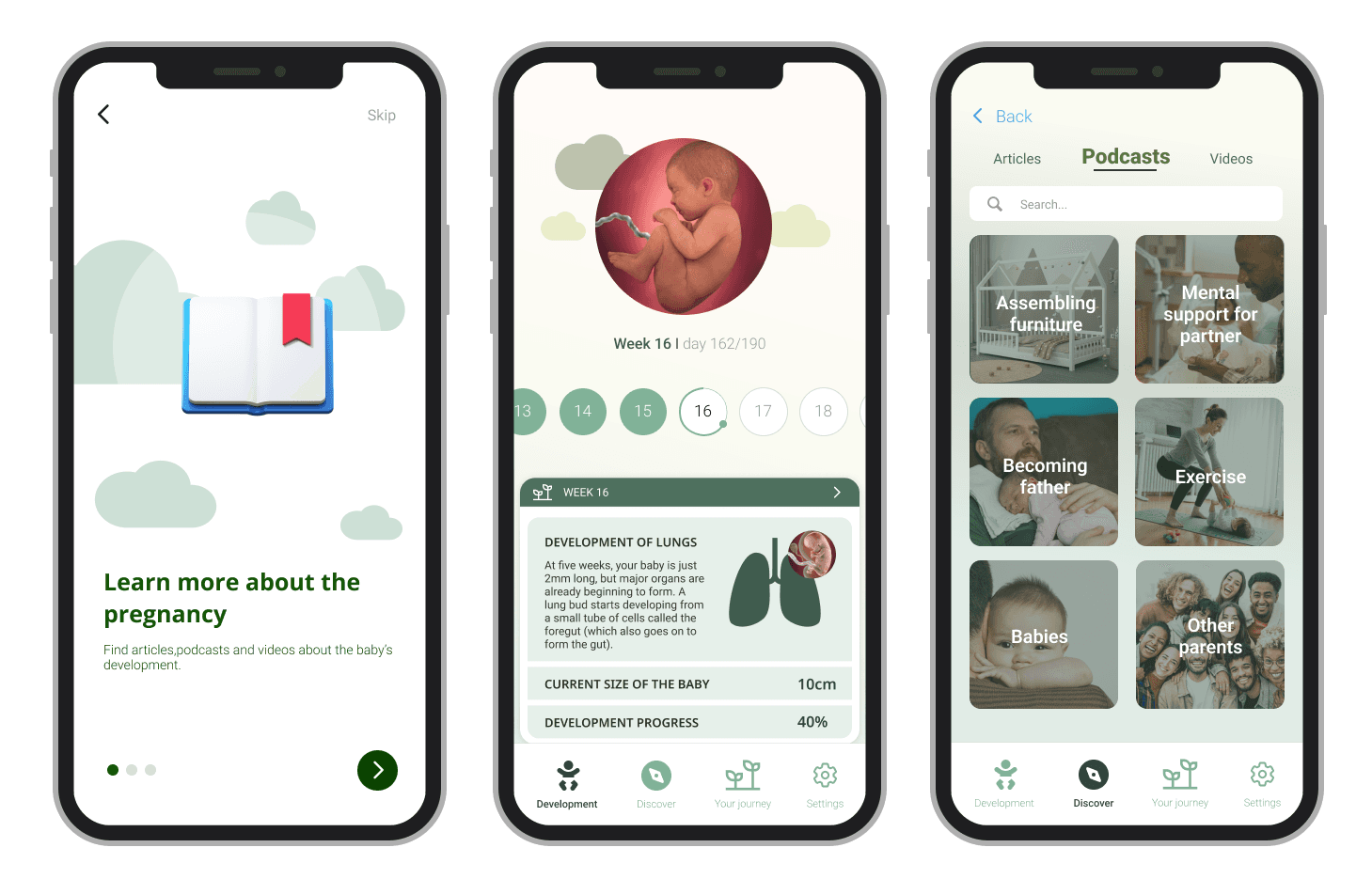
App to connect both parents
Cloud 9 is a pregnancy application formulated following an iterative Design Thinking approach and the different phases of the approach guide the use of the chosen methods. The empathize phase includes a review of related work and a comparison of eight existing pregnancy applications, with an in-depth analysis of three applications. The review of related work revealed that themes such as heteronormativity and gender expectations are present in today's pregnancy applications.
Timeline
This was a second semester project that expanded from January until June 2023. The team consisted of 4 people.
Problem
How do we design a pregnancy application that equally accommodates both mothers and fathers?
Design Thinking
Design Thinking is a design process with a problem-based approach. It consists of five phases: empathize, define, ideate, prototype, and test, which is a constant iterative process, in which we seek to understand the users' needs, define problems, and create innovative solutions. The goal of this process is to find alternative solutions, which are not instantly apparent and therefore need to be further explored.

Design Thinking phases
Empathize & Define
Design Thinking emphasizes understanding user needs, so we aim to involve users directly in our research. Early user involvement not only avoids higher costs later but also leads to a deeper understanding of users’ needs and context of use (Kujala, 2008). According to Pressman, every $1 spent addressing issues during design saves $10 in development and $100 or more after release, highlighting the cost-effectiveness of early user focus (Buley, 2013).
In this project we covered four essential topics: related work, the interaction with products, comparative analysis, and semi-structured interviews.
The research for related work on gender expectations and stereotypes revealed that fathers' involvement during pregnancy was expected by mothers; however, because of gender roles, some applications and online forms were excluding them or making them feel secondary and unequal.
Design principles
Approaching the study of pregnancy applications in terms of their usability, particularly the specific notion of usefulness, aids in explaining not only the interaction between application design and the user experience but also the excitement in which users have embraced these applications. Combining three specific features: multimodality, personalization, and mobility, makes a pregnancy application usable and pleasurable for its users.
When designing interactive products, it is important for the designer to consider who is going to use them, how they are going to be used, and where they are going to be used. Another concern when designing interactive products is to make a usable one by creating a product that is easy to learn, effective to use and provides an enjoyable user experience.

The five design principles that interaction designers can use to have the user experience in focus.
Comparative analysis
We have conducted a comparative analysis of 8 pregnancy applications. The idea behind it is that people develop their expectations from the products and services that they use every day. Therefore it is a good way to start thinking about and discussing what an optimal experience looks like, even before creating any designs. The analysis focused on the different features of the applications. We will not review and analyze all possible features, but choose the most prominent and visible ones, in order to provide the most representative picture of the application possible.

Overview of the pregnancy applications
We have analyzed in depth the first 3 applications and found many similarities. The 3 applications with the highest number of reviews and the highest rating have several things in common. I.e., among other things in terms of the type of knowledge, visualizations, and features they provide. Because of the level of similarities between the applications: ‘Preglife’, ‘Pregnancy +’ and ‘Preggers’, we will not dive into depth with the five remaining applications from our list but continue the comparative analysis by providing a table. The table is made to provide an overview of the different features as well as a division of which of the eight applications has the different features and see which features are most repetitive. In the chart below, an ‘╳’ indicates that a feature is found in the application whereas an empty cell indicates that it is not. The comparison analysis above and the table below will be used further in the ideate and prototype phase to create usable features.
Applications/ Features | App 2 Pregnancy + | App 3 Preggers | App 4 Pregnancy Tracker | App 5 Baby Center | App 6 What to expect | App 7 My Pregnancy App | App 8 Ovia Pregnancy |
|---|---|---|---|---|---|---|---|
Due date calculator | ╳ | ╳ | ╳ | ╳ | ╳ | ╳ | ╳ |
Progress bar | ╳ | ╳ | ╳ | ╳ | ╳ | ||
Current information (This week/day) | ╳ | ╳ | ╳ | ╳ | ╳ | ╳ | ╳ |
Visualization of fetus’s growth | ╳ | ╳ | ╳ | ╳ | ╳ | ╳ | ╳ |
Size comparison to different objects | ╳ | ╳ | ╳ | ╳ | ╳ | ╳ | |
Different sections for mother, partner & baby | ╳ | ||||||
Articles | ╳ | ╳ | ╳ | ╳ | ╳ | ╳ | ╳ |
Communities/groups | ╳ | ╳ | ╳ | ||||
Diary function/ photo journal | ╳ | ╳ | ╳ | ╳ | |||
Checklists | ╳ | ╳ | ╳ | ╳ | ╳ | ╳ | |
Videos | ╳ | ╳ | ╳ | ||||
Podcasts | ╳ | ╳ | |||||
Share information | ╳ | ╳ | |||||
Nutrition advice | ╳ | ╳ | ╳ | ╳ | ╳ |
Comparative analysis of 8 apps and overview of pregnancy applications and their features
The comparative analysis provided an understanding of the current market for pregnancy applications and their features. Currently the pregnancy applications on the market are, to a large extent, similar and the table above illustrates how many of the features that are repeated throughout the different applications. Features and functions such as, visualization of the fetus, due date calculator, articles, and current information (this week/day) are all seen in the compared applications, why we find it useful to reflect upon including features like these when in the prototype.
Gamification: Users’ motivation for interacting with an application
Gamification has become a more popular phenomenon, especially for enhancing user involvement. We introduce this since the comparative analysis showed that the applications all had gamified features. These were: ‘Due date calculator’, ‘progress bar’, ‘visualization of fetus growth’, and ‘size comparison’. Games are known for their ability to engage and excite the user, where they experience mostly intrinsically motivated human behavior such as enjoyment, immersion, flow etcetera. There are 3 categories of game elements: achievement and progression-oriented elements, social-oriented elements, and immersion-oriented elements that are embedded in mobile gamified applications.
The affordance behind achievement and progression are elements including badges, point systems, scoreboard, ranking, and progress bar. These elements have been shown to give the users a feeling of competence by interacting with the type of element.
Social-oriented affordance is focusing on competition, cooperation, social network, and teammates. This element is mainly associated with relatedness e.g., belonging to a team or group where they can work together to solve a common goal or share information amongst each other.
Immersion-oriented affordance is linked to escaping the real world and playing new roles and stories. The game elements include e.g., avatars, profiles, or stories, and by this, the user can be fostered feelings of competence.
Conceptualization of gamification
Semi-Structured Interviews
Due to the time constraint of the project, we had to prioritize the methods that could provide us with valuable insight about these users and their needs in a short amount of time. To achieve this, we conducted semi-structured interviews. Since the usage of pregnancy applications is very individual, gathering our knowledge through semi-structured interviews helped us to inquire about the interviewees' individual needs. We believe it made the interviewees open up and thereby provide honest and credible answers that will be useful in our research- and design process.
When recruiting the interviewees, we set up requirements to help us choose the right group of people to interview. We were inspired by the purposive sampling method. The requirements we set up were that they either had to be expecting a child or have had a baby within the past two years. Further, we aimed to get participants that differed in age groups and nationality to get a wider perspective, that is still realistic when doing pregnancy-related research. We set up these requirements since we wanted our interviewees to have the pregnancy-related experiences as fresh in mind as possible as well as to have a similar frame of reference when talking about media sources, tools etc.
Name | Age | Profession | Nationality |
|---|---|---|---|
Filip | 25 | Soldier | Slovak |
Lucia | 25 | Kindergarten teacher | Slovak |
Shefket | 35 | Forwarding specialist | Turkish |
Elis | 33 | Baker | Turkish |
Vladko | 28 | Systems designer | Slovak |
Dominika | 28 | Working in a ministry | Slovak |
Kristófer | 28 | Doctor | Icelandic |
Noomi | 28 | Doctor | Danish |
Bilen | 30 | Ship worker | Turkish |
Nazan | 25 | Midwife | Turkish |
Alexandros | 26 | Student | Greek |
Emilie | 29 | Student | Danish |
Aydin | 26 | Factory worker | Turkish |
Halime | 26 | Pedagogue | Turkish |
Johan | 25 | Student | Danish |
Amanda | 25 | Student | Danish |
List of interviewees
Affinity mapping
An essential part of a design process is to analyze data that is chaotic and needs structure. This can be achieved through synthesizing the information which can help make sense of chaos. The results of affinity mapping act as a single point of truth as the team continues to move forward, make decisions, and implement them. Having a visual representation of the comparison of the participants' answers on a board gave us the room to look for patterns, understand the current situation, and develop ideas for solutions. The synthesis of findings provided us with knowledge about who the users of the pregnancy applications are as well as their needs. This way we could identify the pain points and challenges that the parents are dealing with during their pregnancy journey.
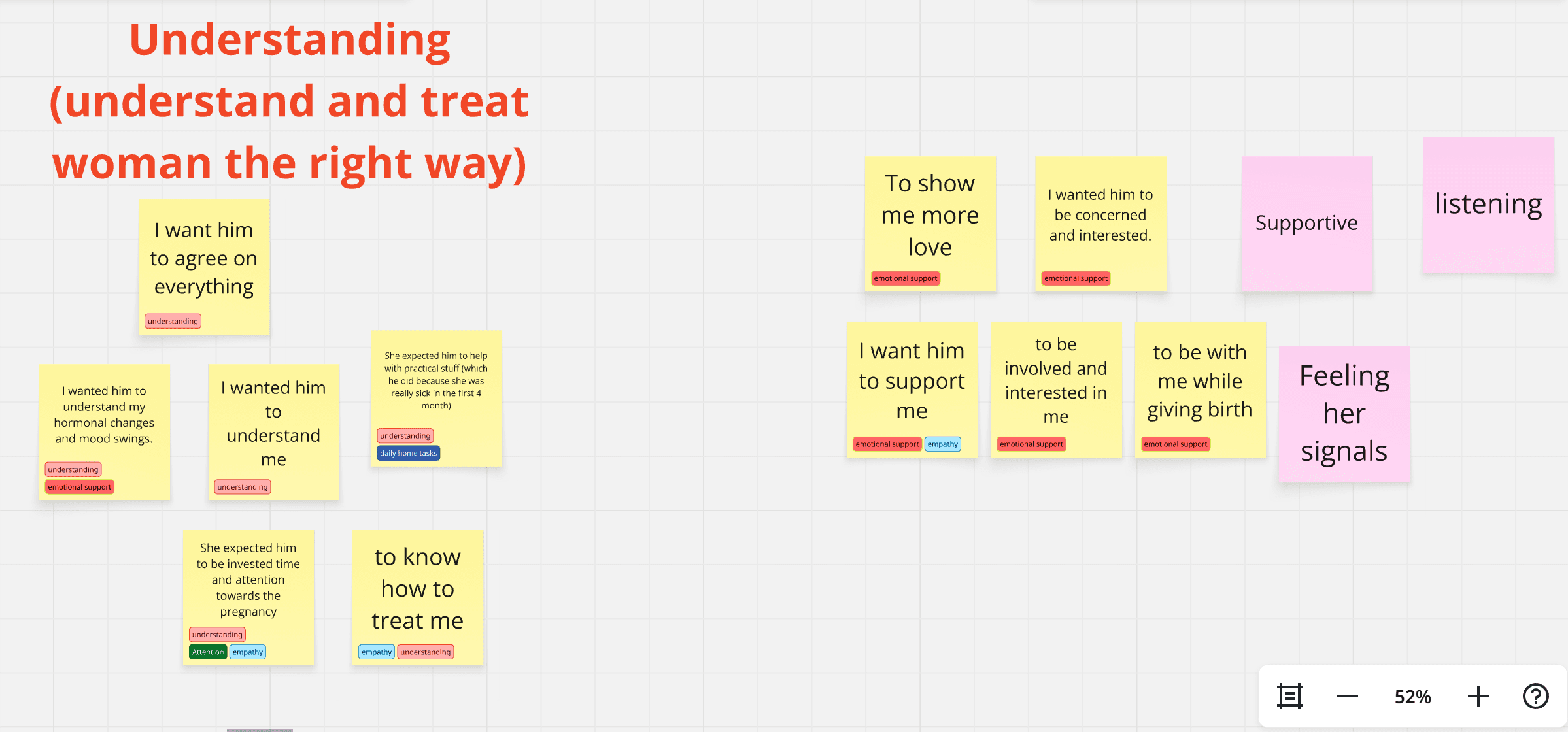
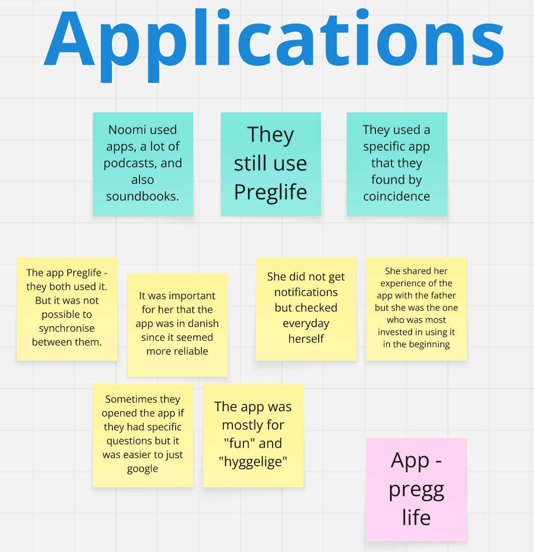
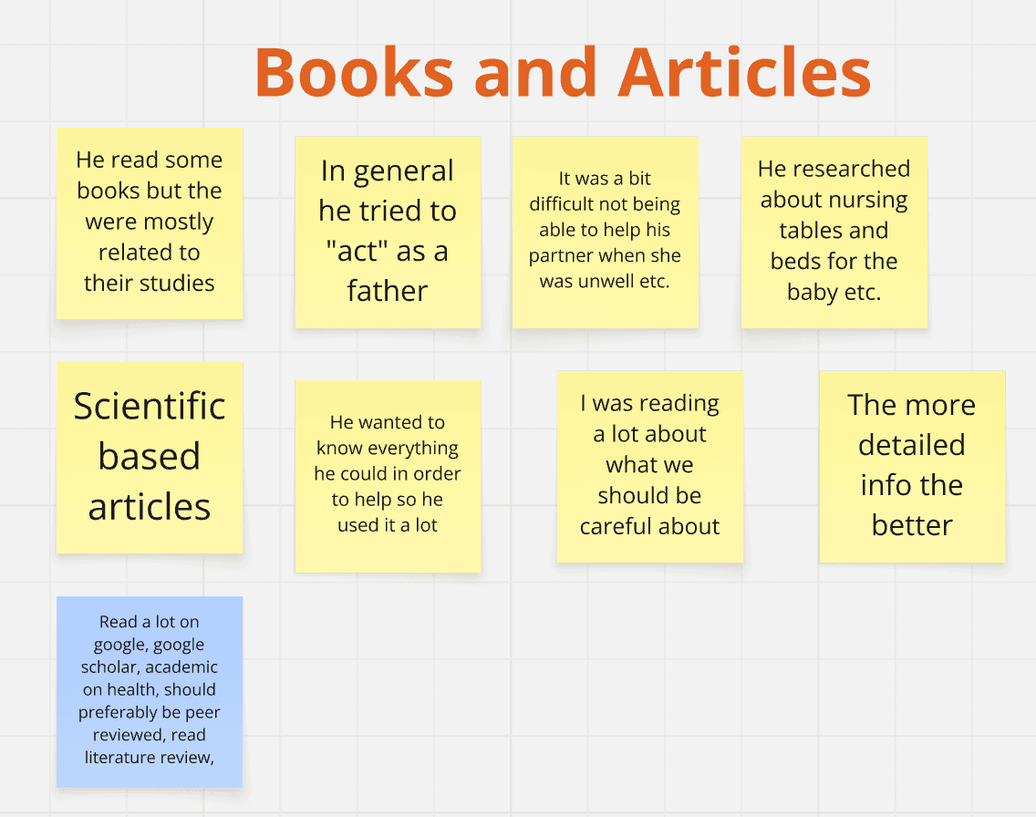
Part of the affinity map
How Might We
In order to define the problem and explore new ideas for features in our pregnancy application, we used the 'How might we' method. We brainstormed several statements, chose two which seemed to represent themes from the interviews, and used them as a guide during the ideation process with 'How might we':
Help couples support each other during pregnancy?
Provide customized information for parents?
Since the pregnancy varies from person to person, they address the need of providing customized content, depending on the user's needs. While some users would appreciate the medical information in their applications, others would value its gamification features enhancing their knowledge about the pregnancy in a playful manner. For this reason, we chose these statements as a starting point for brainstorming the initial design concepts that could represent our design solution.
Data analysis
The aesthetics and technical design of pregnancy applications are often following heterosexual and gendered norms.
Reviews on the applications as well as our comparative analysis show how the applications often omit the single parents, homosexual couples, or other user groups that the applications do not target in their design.
When a user does not belong to the particular heteronormative group that the application is designed for, it affects the usability of the product, leading to frustration and dissatisfaction.
As shown in the first screenshot below, the application ‘Preglife’ provides content for its users about ‘What is happening this week?’ in three categories: ‘baby’, ‘mother’, and ‘partner’. This excludes the user groups like for example the single fathers, gay couples, or others, creating their own families through surrogacy, or parents that are adopting their baby.
Another example that we noticed in the comparative analysis is the icon shown in the second screenshot presenting the ‘parenting’ in the form of two adults and one child. This does not represent the users such as single parents and might have an impact on the application's usability.
In addition to that, the application uses the icon illustrating a mother with a child to present a ‘baby care guide’ shown in the last screenshot, which showcases childcare as a feminized arena. Some users might have trouble connecting to the immersion-oriented element in the application because they cannot see themselves represented in the given avatars.
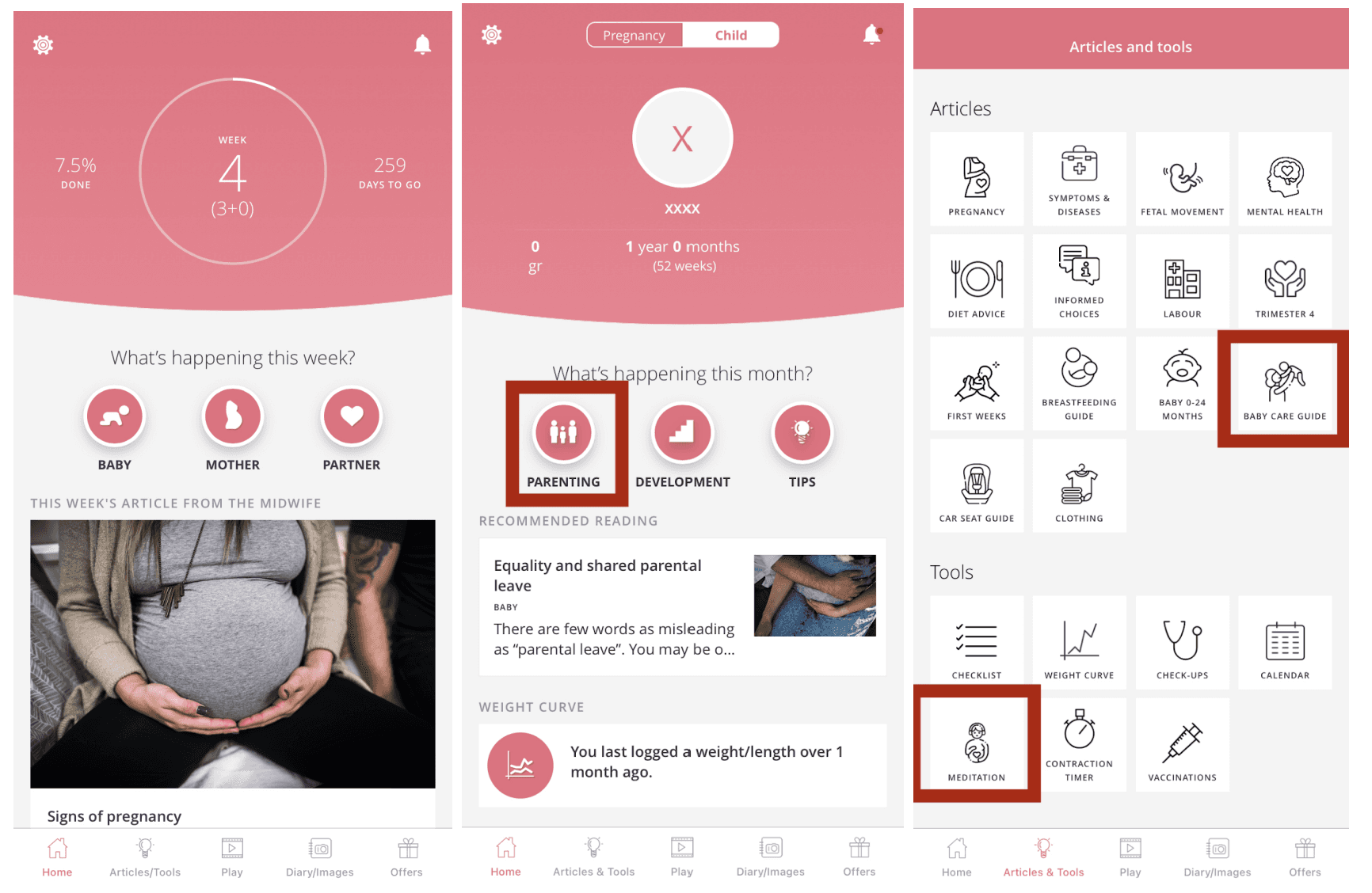
Questioning inclusivity
Fathers’ involvement: Fathers’ level of involvement in pregnancy varied more than initially assumed.
Role of pregnancy apps:
It is unclear whether downloading/using pregnancy apps indicates fathers’ active engagement or whether it reflects their desire for social connectedness and teamwork.
Most fathers did not download pregnancy apps themselves.
Reliance on mothers: Fathers usually relied on their partners (mothers) to share information from apps.
Research implications:
Findings confirm the assumption that fathers often depend on mothers for pregnancy-related knowledge.
These insights should be considered in the next phases of the research/design process.
Ideate
To generate ideas, we used techniques such as sketching, a crazy 8 exercise, and card sorting. By using these techniques, we could generate different ideas, discuss them, filter them, and eventually choose those that could potentially be implemented in our design solution. Before we started the process of sketching, we created a set of user stories to capture and describe the features that could potentially bring value to the end users.
User stories
As a general rule of thumb, it is better to have more, but smaller, user stories, than a few that are too large. Since a big part of our project consisted of research, we did not have enough time to work with iterations as agile teams usually do, and we rather use these stories to present the requirements and needs of the users and estimate the time it will take to deliver them. We complemented our user stories by adding system requirements, as a result of our interviews. Testing user stories consists of a short and incomplete test description guiding the developers to test the story and know when they are done. Creating user stories help us capture and elaborate on the features that bring value to the end users and therefore should be considered for implementation in the prototype.
User Stories | System Requirements |
|---|---|
As a father, I want to see and track the development of the baby so that I can feel more involved in the pregnancy. |
|
As a father, I want to understand the changes happening with my partner, so I can give her the support she needs. |
|
As a father, I want to know how to assemble the baby's furniture, so I can be prepared for the baby's arrival. |
|
As a user of the pregnancy application, I want to be able to browse information about the pregnancy, so I can learn as much as possible before the baby's arrival. |
|
As a mother, I want to learn more about pregnancy so that I can prepare myself. |
|
As a mother, I want my partner to understand me so that I feel supported during the pregnancy. |
|
As a mother, I want to see how my baby grows so that I can better visualize how developed it is. |
|
List of user stories and the system requirements
Sketching & Crazy 8
We used sketching because of its convenient way of presenting the ideas, which is clear and leaves space for a conversation. Sketching encourages critical thinking, opens the mind, and supports innovation, which is central to Design Thinking. Instead of focusing on getting the design right, we aimed to “get the right design” that would fulfill our users’ needs. Some of the key ideas that came from sketching, including ‘Crazy 8’, sparked in our design process were e.g., the features supporting the inclusiveness during the onboarding of a new user, a quiz to broaden the knowledge about the pregnancy, or a frequently asked questions (FAQ) page related to the questions about the pregnancy and parenthood
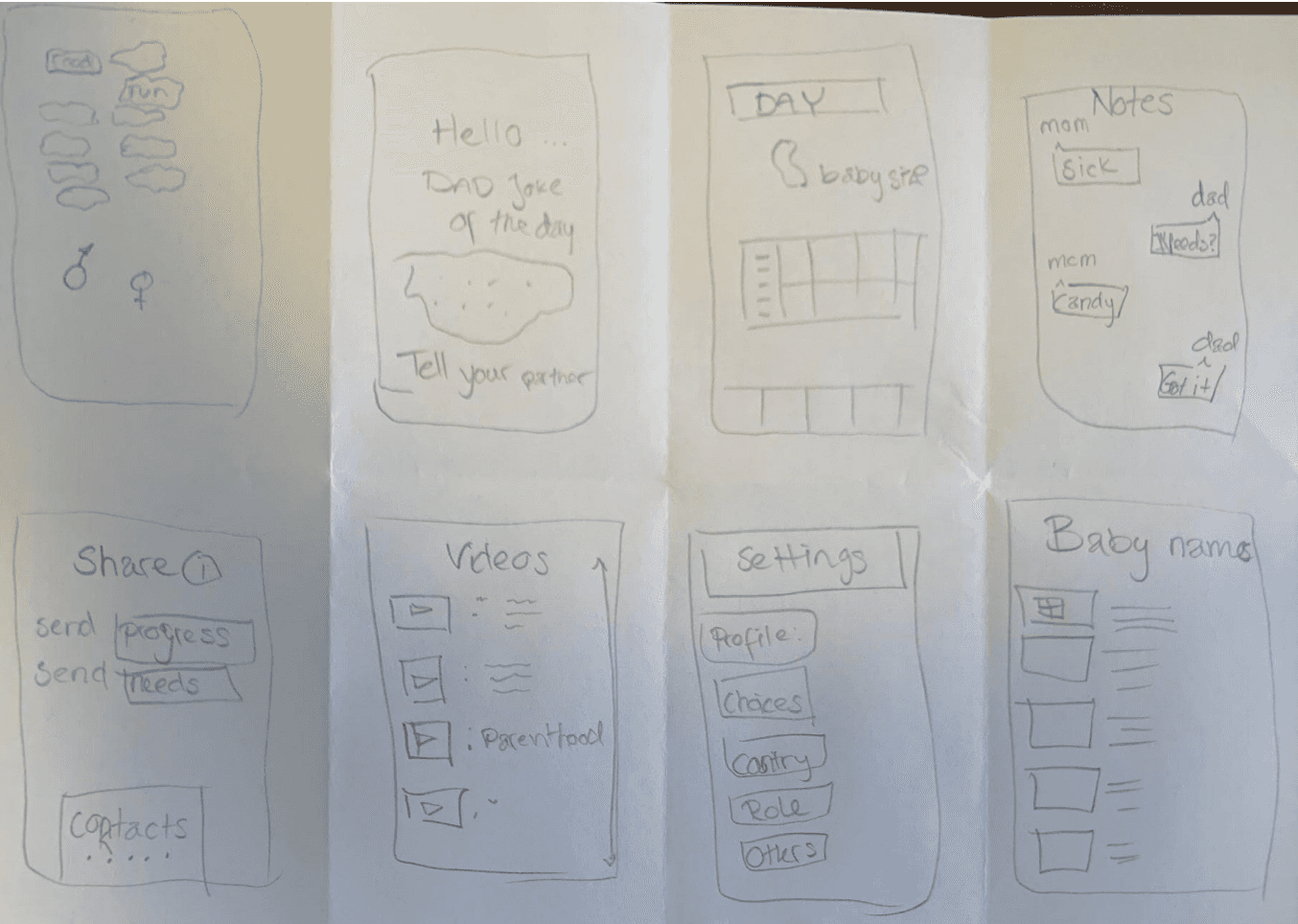
Examples of initial interface sketches
Card sorting
We started the process by identifying the common themes and sections in the pregnancy applications from the comparative analysis. In addition, we made a table of the different application features assembled from the related work. We asked six of the interviewees if they consider these features useful, either in the applications they currently use or in a hypothetical application. . By combining those findings, we decided upon 17 features that we wanted to test out with people who were included as well as those who were excluded from the target group. We decided to conduct the card sorting on three people within our target group as well as five people that are not a part of the target group. We conducted open card sorting on people that do not fit the target group in order to test if they were still able to sort out the content and name the categories. We believe that this can contribute to making the experience of the pregnancy application more intuitive and easier to navigate for new users.
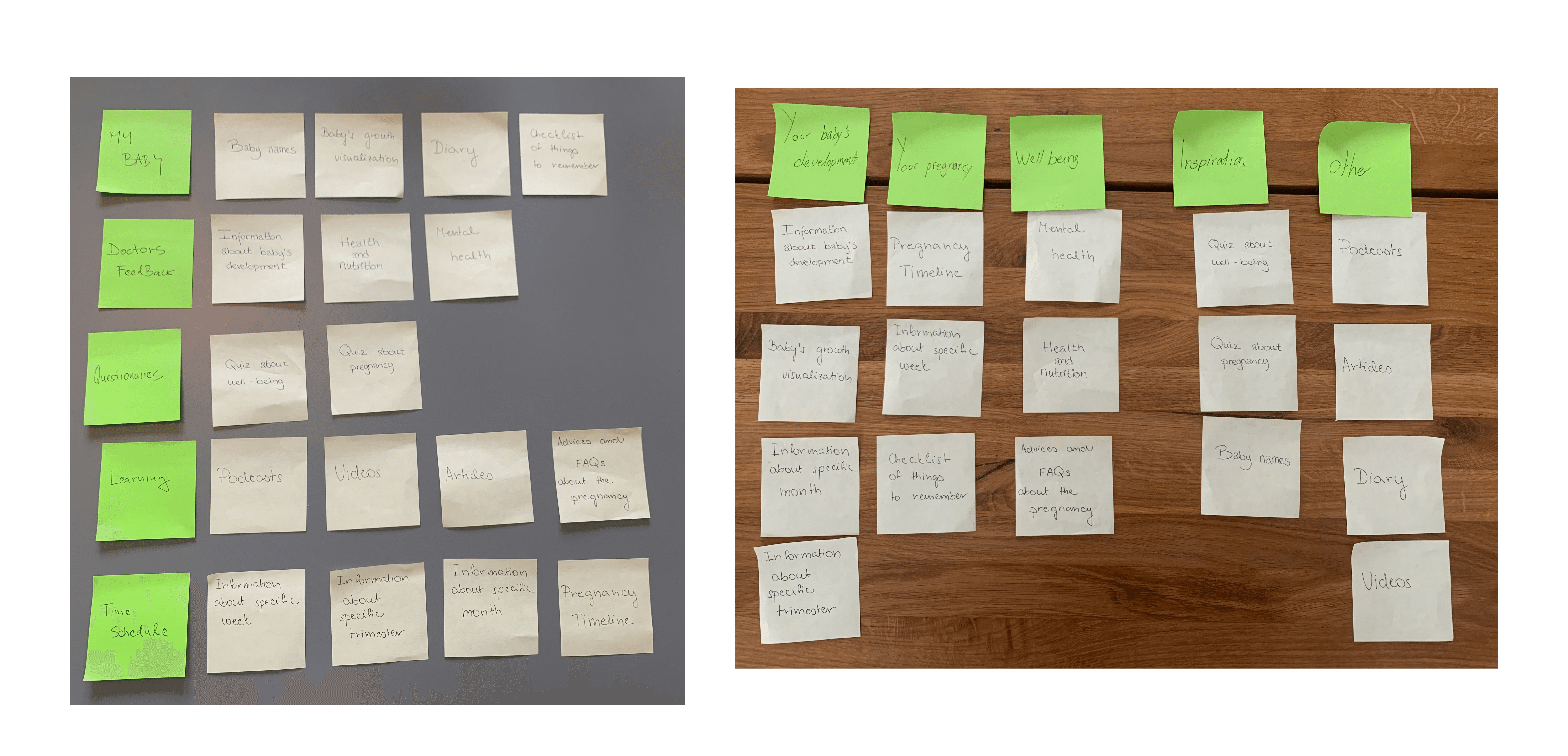
Examples of card sorting
To analyze the findings, we used an online card sorting tool from the UXtweak website. We used hierarchical cluster analysis, where 'hierarchy' refers to the process of aggregating smaller clusters into larger ones until they are all included. To visualize the data, we gathered from open card sorting we used a dendrogram, which is a diagram that illustrates the hierarchy between entities.
The dendrograms are estimated utilizing two methods: Actual Agreement Method (AAM) which answers the question "How many people agreed with this exact group?" and Best Merge Method (BMM) which answers the question "How many people agreed with parts of this group?". The AAM informs what the most popular groupings were, and what percentage of respondents agreed with them. BMM considers which card pairings were the most popular and utilizes that information to draw predictions about the overall card clustering. Because we had eight respondents for card sorting, we based our application’s information architecture on BMM.
When we investigated how they named the cluster, the category name ‘development’ was written by five participants, so we decided to name the category in the menu as development. The second most agreed categorization with 63% included diary, checklist of things to remember, and baby names as a category name ‘your unique journey’. All participants placed podcasts, articles, and videos in the same cluster, however, we decided that advice and FAQs about the pregnancy should be in the same category because in total 38% of the participants placed them together. Most of the participants named this cluster ‘discover’. In the last two clusters, 100% of the participants placed health and nutrition and mental health, whereas 63% identified quiz about pregnancy and quiz about well-being as belonging together in the category ‘well-being’. With these findings, we divided the menu in the application into five categories with name tags that were frequently written in the answers.
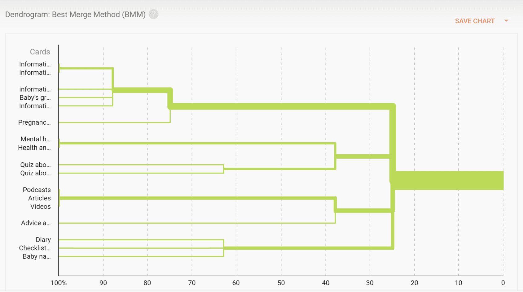
BMM Dendrogram visualization for open card sorting analysis
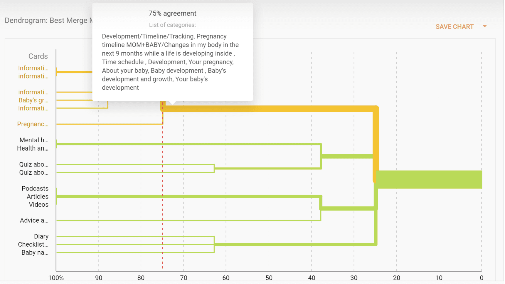
BMM Dendrogram visualization for agreement
The challenge with card sorting was making sense of the collected data from the participants since all of them came up with different categorizations. The dendrogram provided us with a useful lens for examining our data, but it did not provide all of the answers. There are many complexities in the data, it is not black and white. And it's up to the designer to prioritize which categories to utilize and which cards to include in each.
Prototype & Test
One way of creating low-fidelity prototypes is by doing paper prototyping. We created them to easily test our ideas from the ideation phase and to try out our concept. By doing a low-fidelity prototype we can avoid unnecessary details to distract our users.

Examples of low-fidelity prototypes
The paper prototype tested our initial onboarding flow, letting users customize interests and navigate the app. Feedback confirmed the flow made sense and revealed interaction patterns, like preferring a “Start” button over a swipe, which informed the move to high-fidelity prototyping.
We followed the design principles such as visibility, feedback, constraints, consistency, and affordance to create an improved user experience. To increase the users' motivation to interact with the application and enhance user involvement, we implemented different gamification features, including avatars, progress bar, and widgets.
The color pallet that we use is based on gender-neutral colors. We asked the interviewees what they considered gender-neutral colors and used these answers to create a color pallet. The name of the application, ‘Cloud 9’, comes from the “feeling of well-being or elation” where the number 9 also refers to the nine months of pregnancy. As a foundation, we set the main colors, typography, and grids that were used consistently in our prototype.
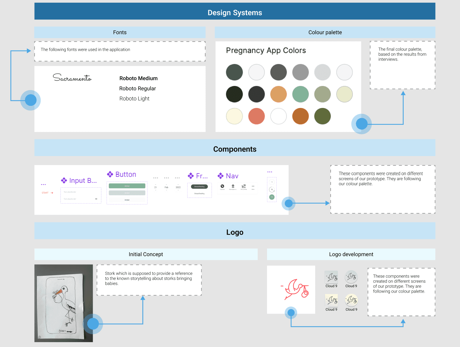
Design guidelines
App Design
We build our onboarding flow based on a specific user and scenario in mind: The user is willing to use a pregnancy application and the requirement from the application is to learn about their baby’s development process.
On the images below you will see the onboarding flow for the pregnancy app, starting with a soft, cloud-themed welcome screen. The following screens highlight key features like educational content, baby’s development tracking, and partner connectivity, using clear visuals, concise text, and a clean, calming design.
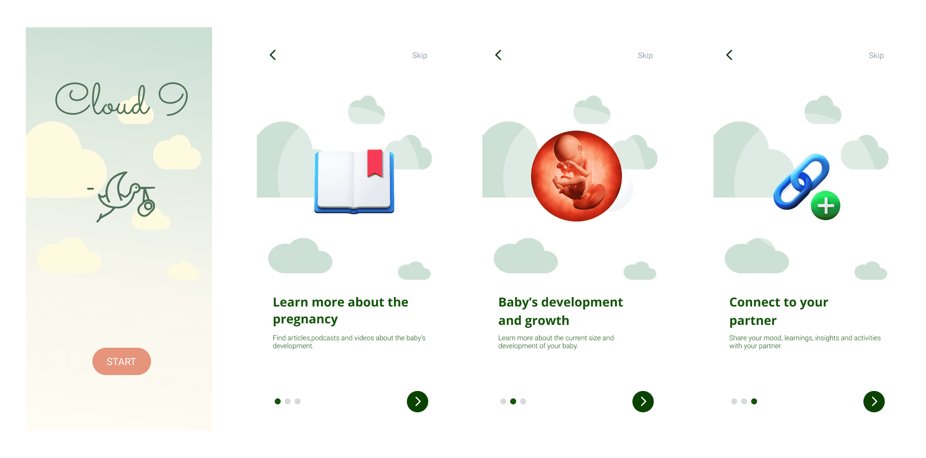
The onboarding flow
Then we have the sign up pages. This consists of input fields collecting information like name, gender, parenting role, and due date. By specifying the due date, the user makes the application more personalized and tailored to their needs. Based on the comparative analysis, this input is required from the user in the initial stage to customize their content on the following pages. The goal of the onboarding process is to collect users’ personal information for future use of the application, saving their details and customizing their content. When the users sign up for the first time, the application directs them to the ‘customize the content’ page. Based on our interviews and related work we can state that pregnancy, and the experience of it, varies from person to person and that each parent has different interests and motivations to use the applications. Therefore, we want to make sure that we target relevant content to each user. To achieve this, we provide the users with a collection of boxes containing different keywords, that they can select and unselect. The keywords were created based on the features that the users expressed that they wished to have in a pregnancy application.
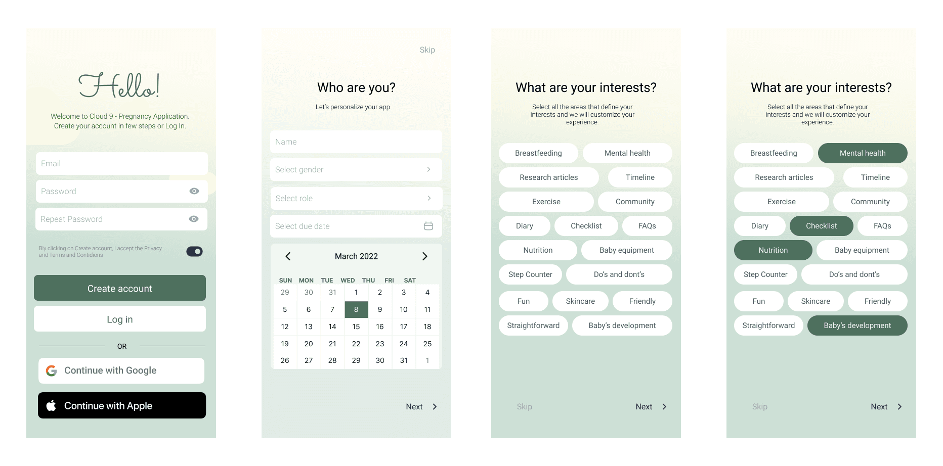
Sign up flow
On the next screen, the user can pick an avatar or upload a picture of themselves, which would help them to customize the application and make the experience more personal.
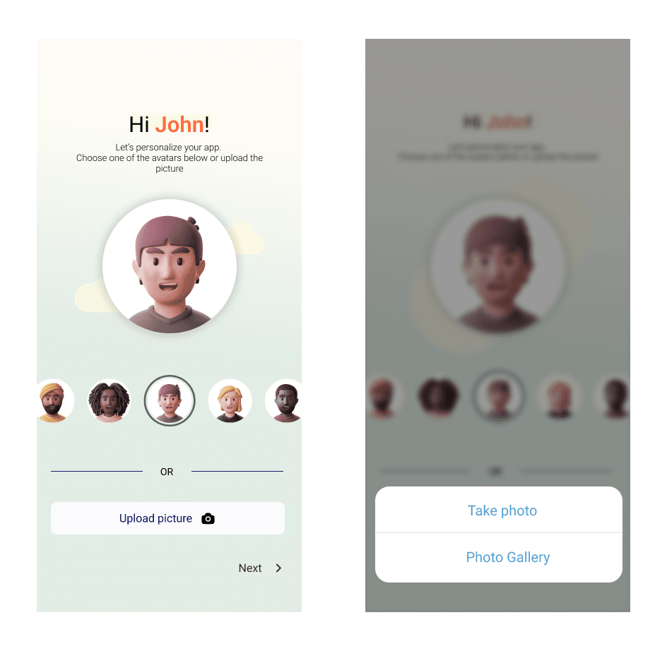
Creating an avatar and uploading image
The connection process consists of four different screens. Users can connect with their partner by sharing or entering a unique code, which links their profiles once confirmed. They can also skip this step, set up only their own profile, and later manage connections through Settings. This feature arose from the insights we gathered from our interviews, where among other things, the mothers stated that they would like their partners to “live the [pregnancy] experience with them”, and to be more “concerned and interested about the pregnancy” and to “support them” in terms of preparation for the baby’s arrival and the mental support. In addition to that, the expecting fathers stated that they often “[...]searched on Google how to behave with my wife when she is pregnant” and they were often “[...]checking the pregnancy app on my wife's phone” to learn more about the pregnancy.
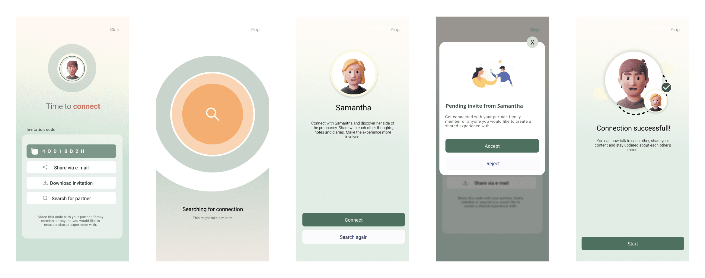
Connection process
The dashboard can be divided into two other subsections: ‘the baby’s development’ section and the widgets. The baby’s development section consists of an illustration of the baby's current size, the progress bar showcasing the current pregnancy week, and a ‘week x’ widget describing the key point about the baby’s current stage of development.
One of the design concepts that we brainstormed are the widgets, which are smaller views of categories containing different topics of interest. By creating widgets, our aim was to customize the content, depending on the user's needs without making assumptions about the topics that each parent might be interested in.
During the interviews, the parents mentioned that they read books and articles, listened to podcasts and audiobooks, and watched videos to learn more about the pregnancy, baby’s development, pregnancy exercises, etcetera. In the "Discover" section the parents can therefore find articles, podcasts, and videos and learn more about the area they are interested in.
The "Settings" subpage lets users edit their profile, manage connections, and customize widgets to personalize their dashboard and discover feed for a unique pregnancy experience.
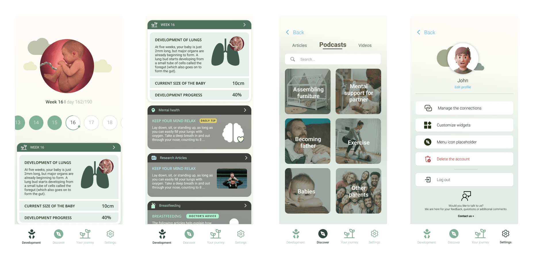
Dashboard
Usability testing of the high-fidelity prototype revealed that while the design was well-received as clean, inclusive, and gender-neutral, users were confused by the partner connection process. Clearer explanations and more intuitive visuals are needed, and feedback also inspired ideas for enhancing social and mental health features.
Things to Improve for version 1.1:
Clarify the partner connection flow with better descriptions and simpler visuals.
Replace or improve the confusing search animation.
Align the avatar and baby visuals for consistency.
Add explanations to avoid confusion with referral/discount codes.
Consider features for mood/mental health tracking and sharing with partners.
Explore social features such as connecting with other couples.
Adjust the “Start” button to avoid game-like associations.
Solution
The project applied Design Thinking to explore how a pregnancy app can equally support both mothers and fathers. Research, including eight parent interviews and comparative analysis of existing apps, revealed that current solutions mainly target mothers and lack customization. Insights showed varied levels of paternal involvement, highlighting the need for a more inclusive, flexible design that addresses both parents’ needs while maintaining familiarity with existing app features.
Version 1.0
We designed the first version of the application ‘Cloud 9’ which allows expecting parents to support each other during pregnancy. This was achieved by creating a platform that equally accommodates both parents by including features that are not only for mothers but where both parents are equally taken into account. We further created a feature that allows the parents to connect to each other for information and knowledge sharing. In our designed application we further allow the users to customize their information by providing them areas of interests that they can mark as relevant to them, depending on their preferences. This way our users can personalize their content, and we as designers can simultaneously avoid making e.g., gender stereotypical assumptions about the users, their interests, and needs.
Results
We were encouraged to proceed with actually building the app.


