PRODUCT DESIGN
COMPANY
Above Sports
ROLE
Product Designer
Scope
6 months
YEAR
2024
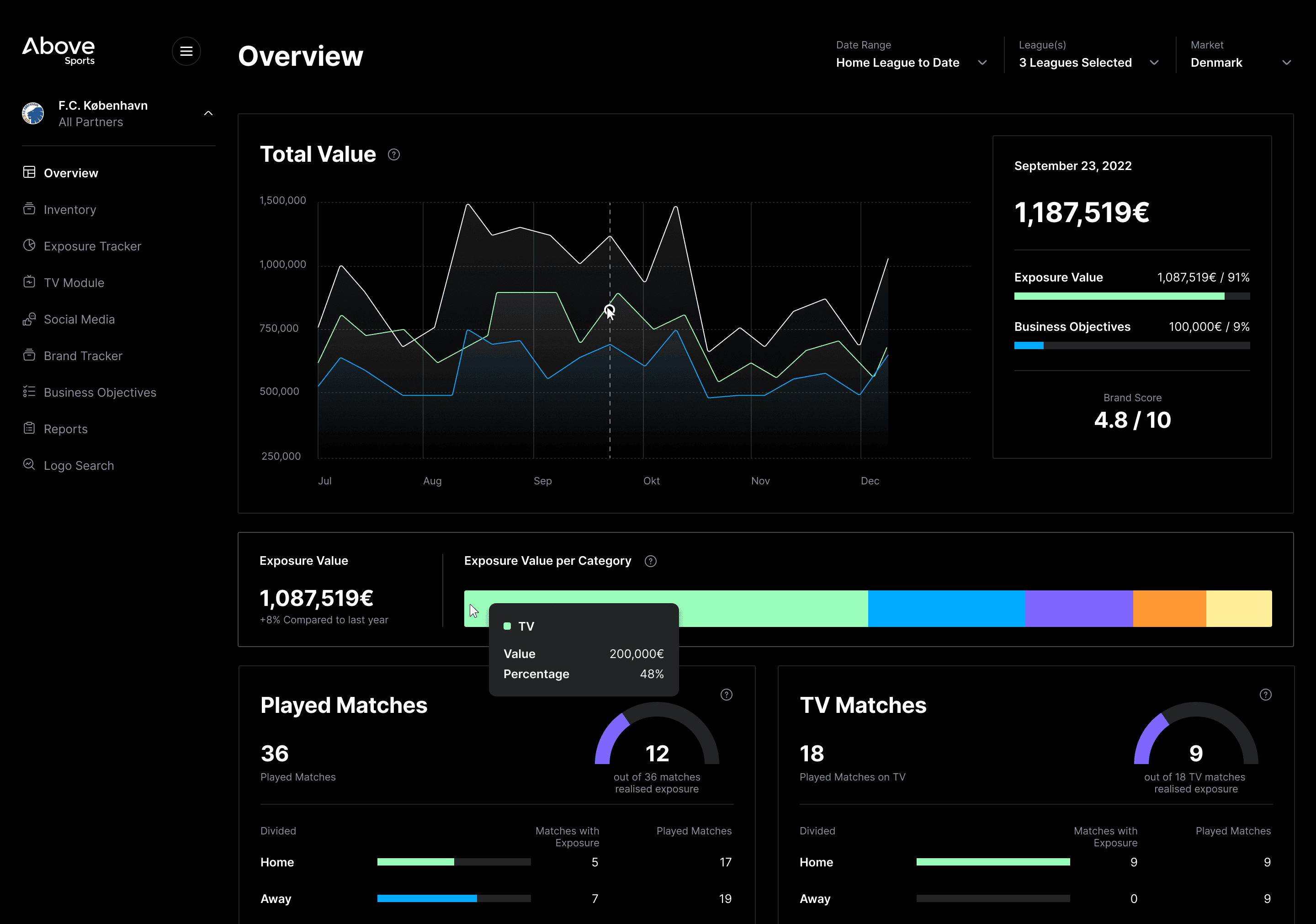
From Data to Visual Impact
Above Sports is a Copenhagen based tech company that offers a sponsorship management platform that automates the tracking and analysis of sponsor logos and visibility across jerseys, pitch placements, screens, and social media, providing real-time insights to clubs like Brøndby IF and their sponsors such as Betano, Hummel, NTG, and Carlsberg to maximize sponsorship value and engagement.
The company required a complete redesign of its platform, which streamlines sponsorship measurement by automatically collecting and analyzing logo visibility data. The problem was that the infographics were unclear to clients, and the company was not meeting its targets.
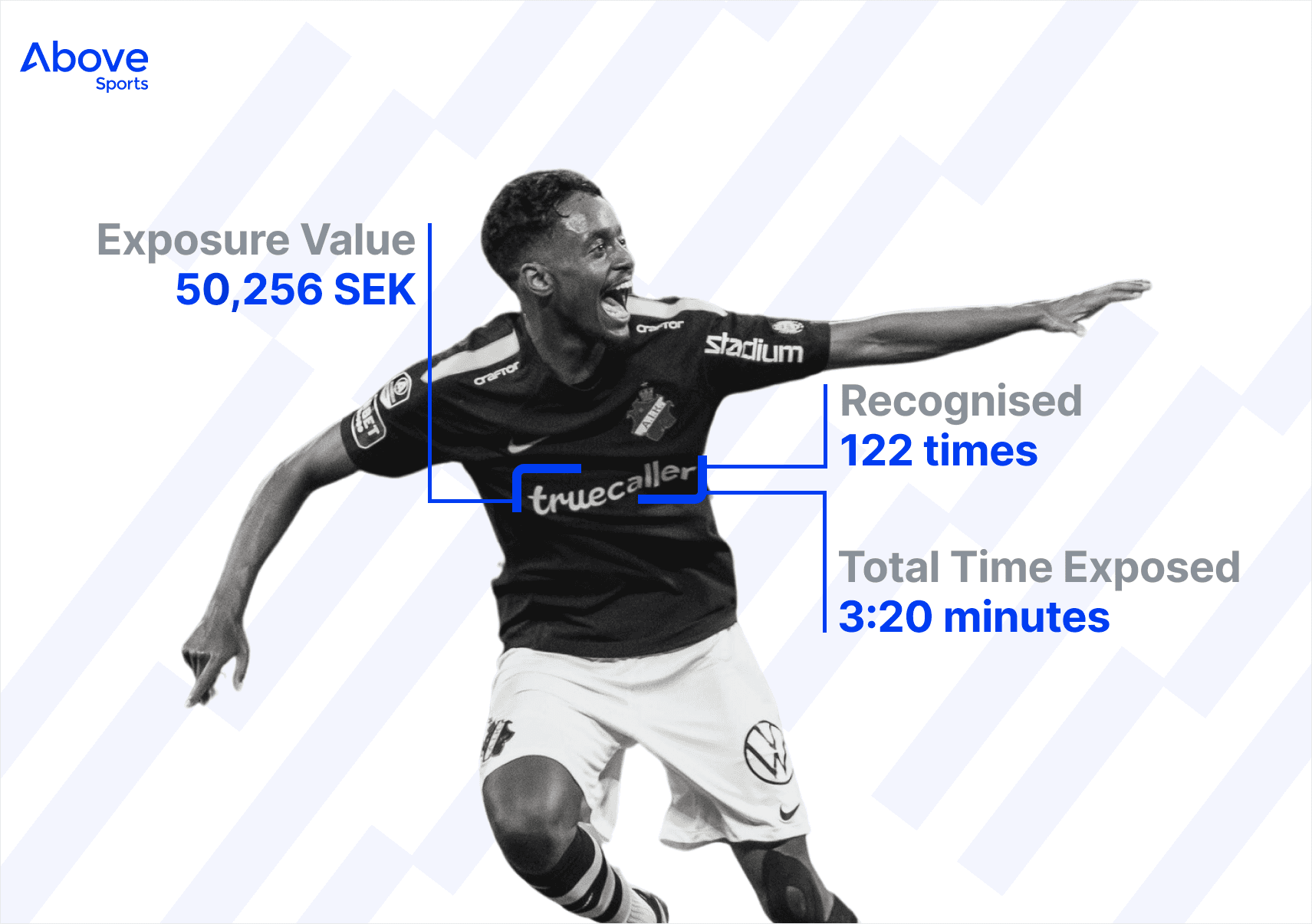
Identifying Truecaller logo exposure during a match
Team and my role
This cross-functional initiative featured an evolving team structure that scaled throughout the product lifecycle, comprising a product manager, 2 product designers, 5 developers, and 2 data analysts.
As product designer, I contributed to the complete design thinking process from participating in research, ideation sessions and collaborative sketching workshops to developing wireframes, creating high fidelity interfaces within our established design system, and conducting iterative usability testing to validate design decisions and optimize user outcomes.

Making Sense of Sponsorship Data
Before we dived in into research and development we had an overall idea on what challenges the clients had and what could be changed on the product.

The problem
This project was initiated as a cornerstone of the platform's comprehensive redesign strategy, addressing critical UX challenges. The existing pages had become problematic due to information architecture issues, cognitive overload from complex data visualizations, and poor information hierarchy that failed to meet the mental models of the expanding user base.

Platform's old design
Through heuristic evaluation and user journey mapping, we identified that the page no longer aligned with the platform's evolving value proposition or the expectations of newly acquired enterprise customers from recent business expansion. You can see the old version of the platform below.
Market analysis revealed that competitors had begun offering more intuitive data visualization frameworks with progressive disclosure techniques, while our usability metrics showed declining engagement and increased bounce rates.
Making Sense of the Mess: The Art of Clear Infographics
Our goal to improve navigation, information hierarchy, and overall usability, ensuring it aligned with both our business objectives and the expectations of our evolving user base.
Until the launch on we developed 6 web pages: Overview, Inventory, Exposure Tracker, TV Module, Business Objectives and Brand Tracker. In this case I will focus on only on the Overview page in order to keep it concise.
User Insights & Market Analysis
Due to time constraints and resource limitations for conducting in depth research, we leveraged existing data insights from customers and performed competitive analysis of major sponsorships platforms in the market. Our research approach focused on identifying customer pain points through direct feedback and understanding the current product landscape. By analyzing what solutions already existed and mapping them against user frustrations, we built a foundation of insights that informed our design decisions and helped us identify opportunities for differentiation in the sponsorship management space.

Our clients expanded from Danish football and handball clubs to corporate partners.
Collaborative Concept Development
Leading cross-functional collaboration through regular sync sessions with developers to address technical constraints, working alongside the project manager to align design deliverables with sprint timelines, and partnering with data analysts to incorporate meaningful metrics and visualization best practices into the interface contributing as the UX communication bridge between technical and business stakeholders, translating complex requirements into intuitive design solutions.
Wireframing & UX Design
I analyzed and defined optimal content hierarchy, navigation patterns, and user flows that addressed business and user needs.
By creating low-fidelity sketches and wireframes on Miro I rapidly explored layout options and validated structural decisions. I created a short workshop with the team where I presented my ideas and then we all brainstormed and added new points. Here the backed developers challenged me with all kinds of scenarios and I shortly understood that I had to work on more user flows.

Brainstorming with the team on Miro board
During the early stages of the platform redesign, I developed one page high-fidelity prototype where we presented to some of our clients to test and get their initial feedback. We conducted formative usability testing to evaluate the new layout. We began each session by informing users that although the layout had changed, the core functionalities and key metrics they were familiar with remained the same.
Initially, we asked participants to interact with the prototype naturally, as they would with the existing version. This allowed us to observe their behavior in an open-ended, exploratory way without guiding them. We took detailed observational notes as they navigated the interface. Then I introduced them some task-based scenarios by asking them to locate specific information or complete targeted actions to evaluate task flow and discoverability.

High-fidelity prototype for the Overview page
After all the findings, I developed detailed interactive prototypes and component specifications, ensuring alignment through documented guidelines.
The sponsorship dashboard was designed to provide both a comprehensive overview of all partners and detailed insights for individual sponsors. In the “All Partners” view, users could see aggregated data across all sponsorships, including total value, exposure value, exposure value per sponsorship category, and overall audience reach. This high-level perspective equipped business stakeholders with the tools to evaluate the overall health and performance of their sponsorship portfolio, identify category trends, and benchmark results across partners using clear, data-driven visualizations.

All partners view
When a specific sponsor was selected, the dashboard dynamically updated to display only that sponsor's data. While the structure remained consistent with the all-partners view for familiarity, the figures shown were tailored to the individual partnership. In addition to refined exposure and engagement metrics, this view featured dedicated metric cards highlighting key performance indicators such as the number of played matches, TV viewership, social media engagements, live attendance, and demographics like age-based visits. This allowed sponsorship managers to confidently assess the effectiveness and ROI of each sponsorship, facilitating more strategic planning, reporting, and partner communication.

One partner view
Development & Documentation
Throughout the project, I created comprehensive documentation to ensure clarity and alignment across the entire development team. For backend tasks, I wrote detailed scenarios and described all functional logic directly in the corresponding Asana tasks, making them easily accessible to everyone involved at any time. For frontend work, I maintained documentation both within Asana and in our shared Figma files. This dual approach allowed developers to quickly reference specifications and design details exactly where they were already collaborating, streamlining implementation and reducing communication gaps.

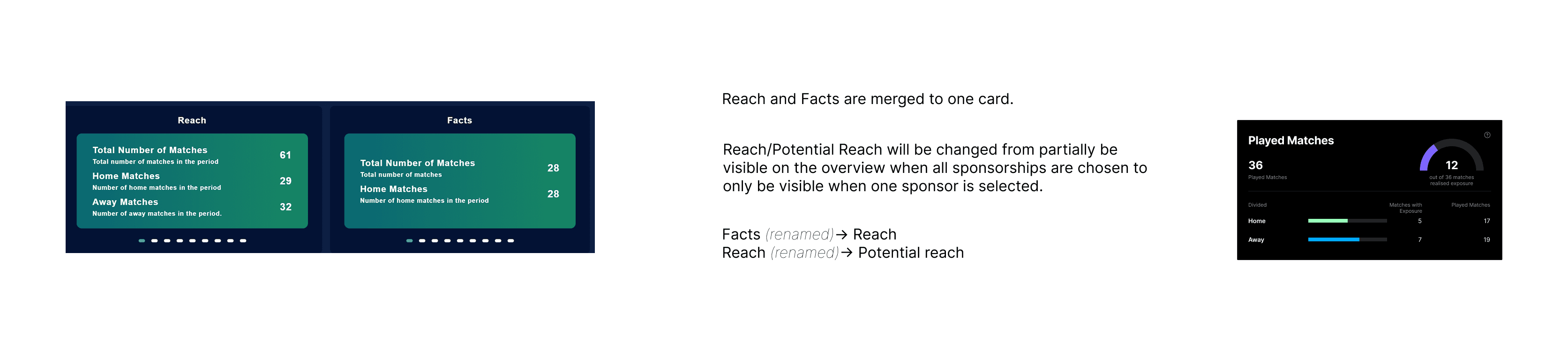
Documentation examples
Testing
I played an active role in testing the application alongside the project manager, with both of us sharing responsibility for validating a wide range of user scenarios. We conducted tests across both in testing and QA environments to ensure all key functionalities worked as intended and that the user experience met our design and business expectations. This hands-on testing approach helped identify and resolve issues early, ensuring a smooth and reliable deployment to production.
Results
After launching the new platform, users were successfully onboarded and quickly began spending more time engaging with the product. By streamlining onboarding and improving usability, we helped users reach their goals faster, which directly led to increased session durations and more frequent interactions
Growing User Base
We doubled our client base shortly after launching the new platform.
Increased user engagement
Stronger connection between users and our platform by delivering timely, personalized interactions that add value.


